The Power of Interior & Exterior Signage
In the high-noise world of retail marketing with apps buzzing, screens glowing, and loyalty platforms flashing with gamified offers it’s easy to overlook one of the oldest tools in the playbook. Signage. Quiet, static, and in many cases, literally bolted to the wall. If you’re serious about running a store that communicates clearly, moves product intentionally, and feels organized to a customer walking through for the first time, signage is not something you install and forget. It’s something you design with purpose and revisit often because good signage doesn’t just inform, it sells, shapes perception, and builds a brand.
Take the front of your store. The exterior is not just the customer’s first impression, it’s their first decision point. A clean, professionally mounted sign above the door tells them you’re open, stable, and confident in your offer. Window clings that are refreshed seasonally signal that your store is active, not neglected. Parking lot signage that’s clear, visible, and consistent with your interior tone builds immediate trust, but even more than that, it tells a customer “we care about what you see before you ever touch the door”.
In the Southeast, where weather takes its toll and sun-fading is a real threat to vinyl graphics, too many stores fall into the trap of letting signs age without audit. A peeling sticker that once read “Two for $3!” may not be legible anymore but it still says something, just not what you intend to say. A branded coffee banner with an outdated price does more than confuse, it creates doubt. If the price is wrong, what else is off? If the signage feels tired, does the store feel neglected? These small things compound. A cluttered and inconsistent entryway with stickers on top of decals, handwritten Sharpie notes, and six different font styles tells a customer that the inside will be more of the same. If they’re new, they might turn around. If they’re loyal, they’ll lower their expectations.
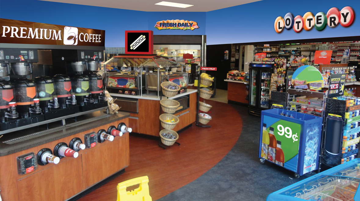
Contrast that with a store that treats signage as part of the retail experience. The parking lot is clearly marked with short-term parking zones, clean directional arrows, and pump-to-store messaging. The windows are clear with no more than 25% coverage and displays two to three bold seasonal promotions. The brand logo is cleanly lit and evenly mounted and at night the LED lighting doesn’t flicker. These stores draw you in before you even know what’s inside.
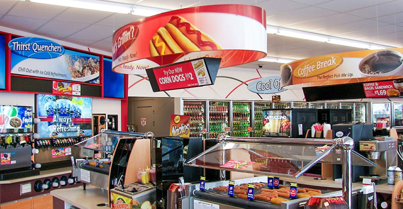
When you step through the door? That’s where the real work begins. Interior signage is not just about labeling products, it’s about telling a story. The best stores are laid out with a sense of order and flow, and the signs carry that message. Whether it’s a hanging aisle sign that reads “Cold Drinks That Actually Chill” or a cooler door cling that says “Hydration Starts Here,” what you say and how you say it matters. Tone, clarity, color, and contrast are the building blocks of visual communication and customers respond to them whether they realize it or not.
One store just outside Savannah completely reworked its interior signage in the spring of 2025. The owner invested in a full refresh swapping outdated manufacturer clings and mismatched shelf-talkers for a unified visual language. Fonts were standardized and color palettes matched their brand’s primary logo. Category signs weren’t just functional, they were friendly. Within two weeks average basket size rose 7%. Not because of a major remodel or price changes, just because customers could finally understand the layout. The path from product to purchase became intuitive.
This isn’t just about aesthetics because signage moves product. It anchors promotions, supports upsells, and guides behavior. If a sign above your coffee station says “Add a pastry, save a buck,” and it’s designed well, you’ll move more pastries. It’s not magic, it’s retail psychology. The message gets into the customer’s mind before they have time to make another choice.
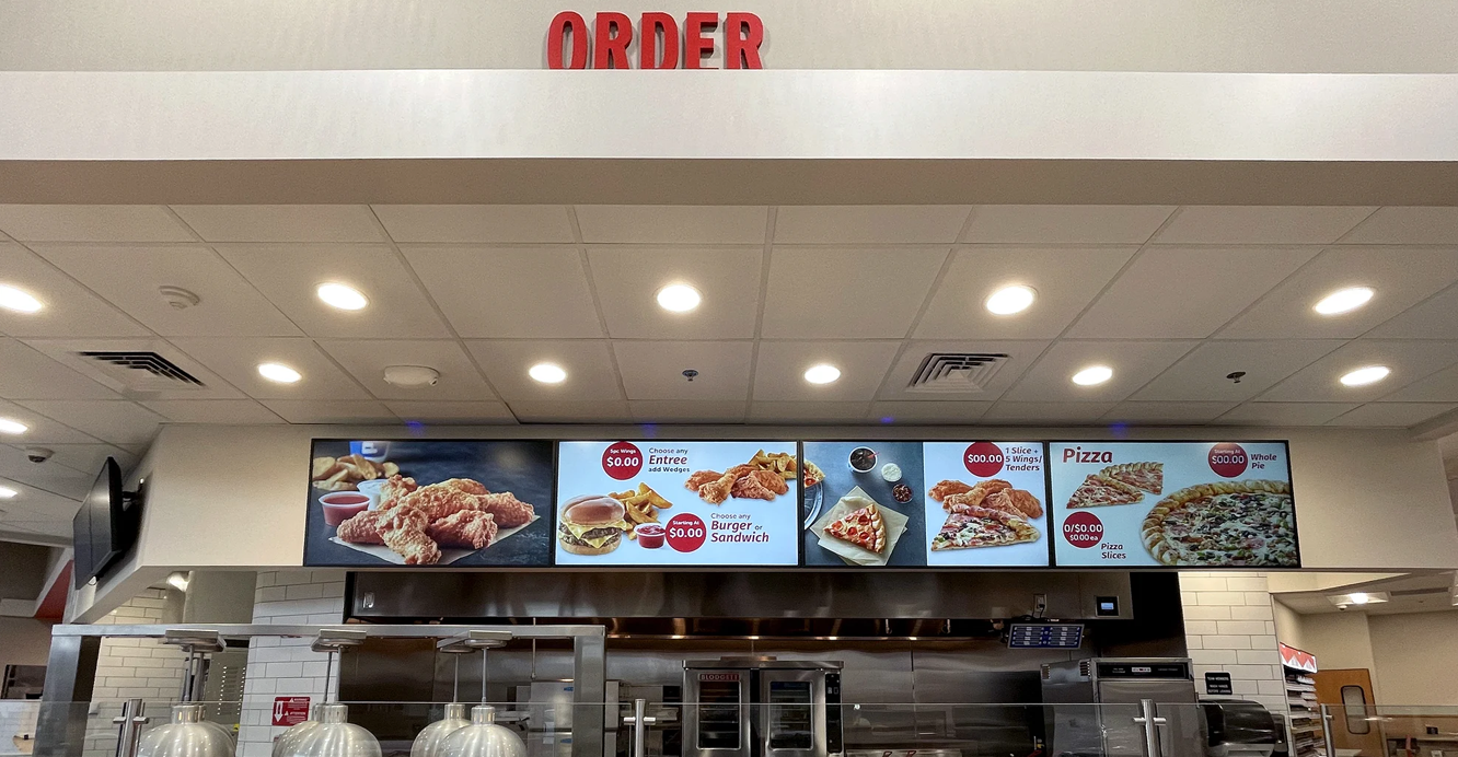
In foodservice, signage plays an even bigger role. Menus have to be clean, consistent, and aligned with your operational flow. If you’re running a made-to-order sandwich program, the layout of that menu—what’s emphasized, what’s price-called, what’s bundled—can make or break the speed of service. Customers don’t want to squint at a wall of laminated sheets, they want confidence in their order. Big, clean fonts, clear options, and photos that feel real. If your breakfast program is working, let the signage support it. Don’t bury the biscuit deal on the side panel, give it a headline and make it intentional. Remember: in foodservice, confusion kills and clarity builds.
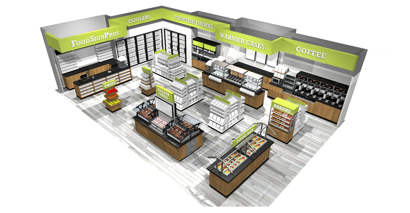
Then there’s the unspoken signage, which is your merchandising cues. The way products are blocked together. The way endcaps suggest a moment such as a road trip, snack break, or hydration reset. These are silent sellers but they work hand in hand with your traditional signage. The feeling of being led to what you’re looking for is what signage helps you create.
Stores that embrace this mindset often find themselves leading in categories where others lag. A retailer in central Alabama built a “Stay Sharp” section near the entrance. It is a wire rack stocked with functional drinks, protein bars, and wellness snacks. The sign didn’t just describe the category, it gave it meaning. It connected with the customer’s intention: stay alert, feel good, fuel up. That section now outperforms the traditional snack aisle three-to-one during morning hours. Why? Because it speaks to the moment. Good signage doesn’t just name products, it frames experiences.
Signage is not a one-time project, it’s an ever-changing asset. Just like you wouldn’t leave stale coffee on the burner for a week, you shouldn’t leave outdated signs on your walls. Audit, refresh, and reimagine. If a promo is over, pull the sign. If the price changed, change the sign. If the season shifted, so should the window messaging. These may seem like small things, but in the aggregate, they define the quality of your store.
Even handwritten signs have a role when used intentionally. A chalkboard with daily specials, written neatly and with personality, can humanize your store. A dry-erase board near the checkout that says “Staff Pick of the Week” makes employees feel involved and customers feel included. But that only works when it’s legible, consistent, and cared for. Sloppy Sharpie notes taped to coolers are not the same. If you have time to print a sign, do it right. If you’re hand-writing it, do it with pride.
And don’t forget about the checkout counter. The last thing your customer sees before they pay is often the thing they remember most. A smartly placed counter cling, a clean loyalty prompt, a friendly “Thanks for stopping by” graphic—all of it matters. The checkout is more than a transaction point, it’s your store’s final impression so make it one that reinforces your values.
Signage is strategy. It’s not the icing, it’s the structure. It sets expectations, drives movement, and reflects whether your store is operating with purpose. In a market where convenience is increasingly about clarity and connection, signage is how you show you’re listening. It’s how you guide, welcome, reassure, and reinforce.
So walk your store as your customer does. What do they see before they speak to anyone? What do they read before they ask a question? What signs are guiding them and what signs are missing?
Because in this business, you’re communicating every second of the day.
Newsletter
Stay Informed with
Top Headlines
Category

Insights and trends shaping U.S. convenience retail.
Content is provided for informational purposes only and does not constitute legal, financial, or professional advice.